Introduction
This first iteration of the storymap only uses data from 2017. Hence it is a static page to tell the story that we found in the first national assessment. As more years of data become available for the social, economic, and ecological indicators, we envision this becoming a dynamic storymap. There is much that can be done with the data in the future, but this page represents version 1.0.
What is the National Assessment and Why was it Done?
Rangelands are land that is generally termed as grassland, shrubland, woodland and savanna, tundra and alpine, and barren lands (https://wrangle.org/continent/north-america). The primary commercial use of rangelands is by domestic livestock (e.g., cattle, sheep, and goats). Rangelands also provide society with a wide variety of nonmarket goods and services, also known as ecosystem services.
Table of Contents
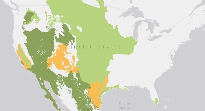
In this national assessment, we will examine a good portion of these identified rangelands for the data related to rangeland sustainability. As we will discuss in the next section, not all of the areas met our definition of rangeland communities. Because these lands are locally, regionally, nationally, and internationally important, many people want to find out if they are being managed sustainably and producing the goods and services we want in a sustainable manner. In 2001, the Rangelands Roundtable (RR) began a process to help lead to those answers. The RR process convened representatives from a variety of interests to come to agreement on what things should be measured to guide the discussions on rangeland sustainability. RR adopted the Brundtland definition of sustainable development and applied it to rangelands and the communities dependent upon them. The Brundtland Report defined sustainable development as “development that meets the needs of the present without compromising the ability of future generations to meet their own needs.”
The RR adapted this for rangelands as “We envision a future where the social, economic and ecological complexity of rangeland science and management is understood and valued, rangeland-dependent communities are profitable and healthy, and leaders are equipped to make collaborative, data-informed decisions” (https://www.rangelandsroundtable.org). Five broad Criteria (https://www.rangelandsroundtable.org/projects/criteria-and-indicators) were settled upon to represent ecological, social, and economic aspects of rangeland sustainability. Criteria are defined to be very general and not directly measurable. Under the criteria, indicators were agreed upon. Indicators are things that can potentially be measured and lead to discussion on what they mean.
Selection of Counties for National Assessment
The 690 selected counties are shown in the following two figures based on the percent of the county in rangeland vegetation and the population density. The cutoff of a county having greater than or equal to 25 percent of rangeland by area was initially selected to be called a rangeland county. Additionally, fewer than 76 people per square kilometer (200 per square mile) was used as a cutoff for rural counties. In essence we decided to remove highly populated counties that had more than 25 percent rangeland in order to try to adjust for the economic and social impacts of the population centers.
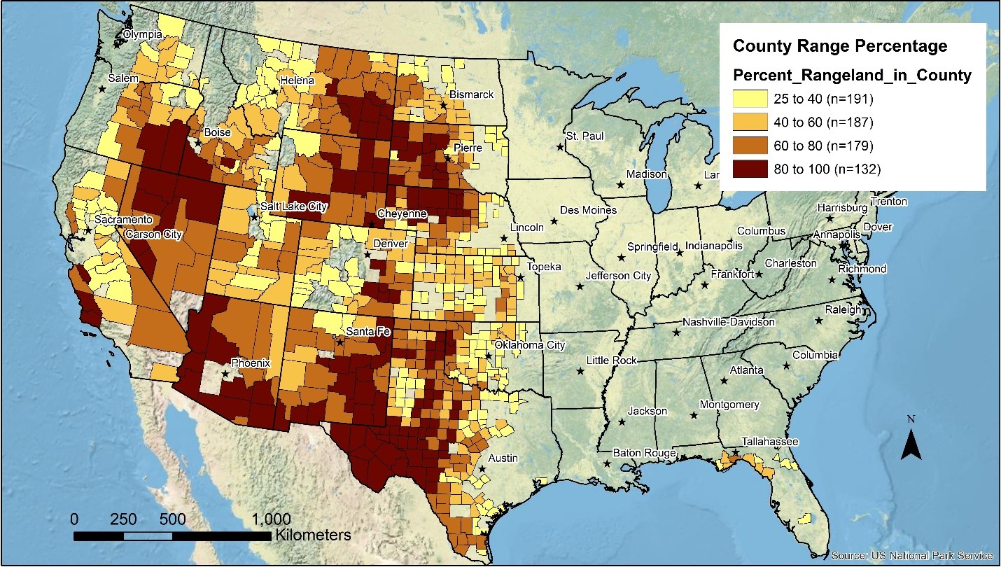
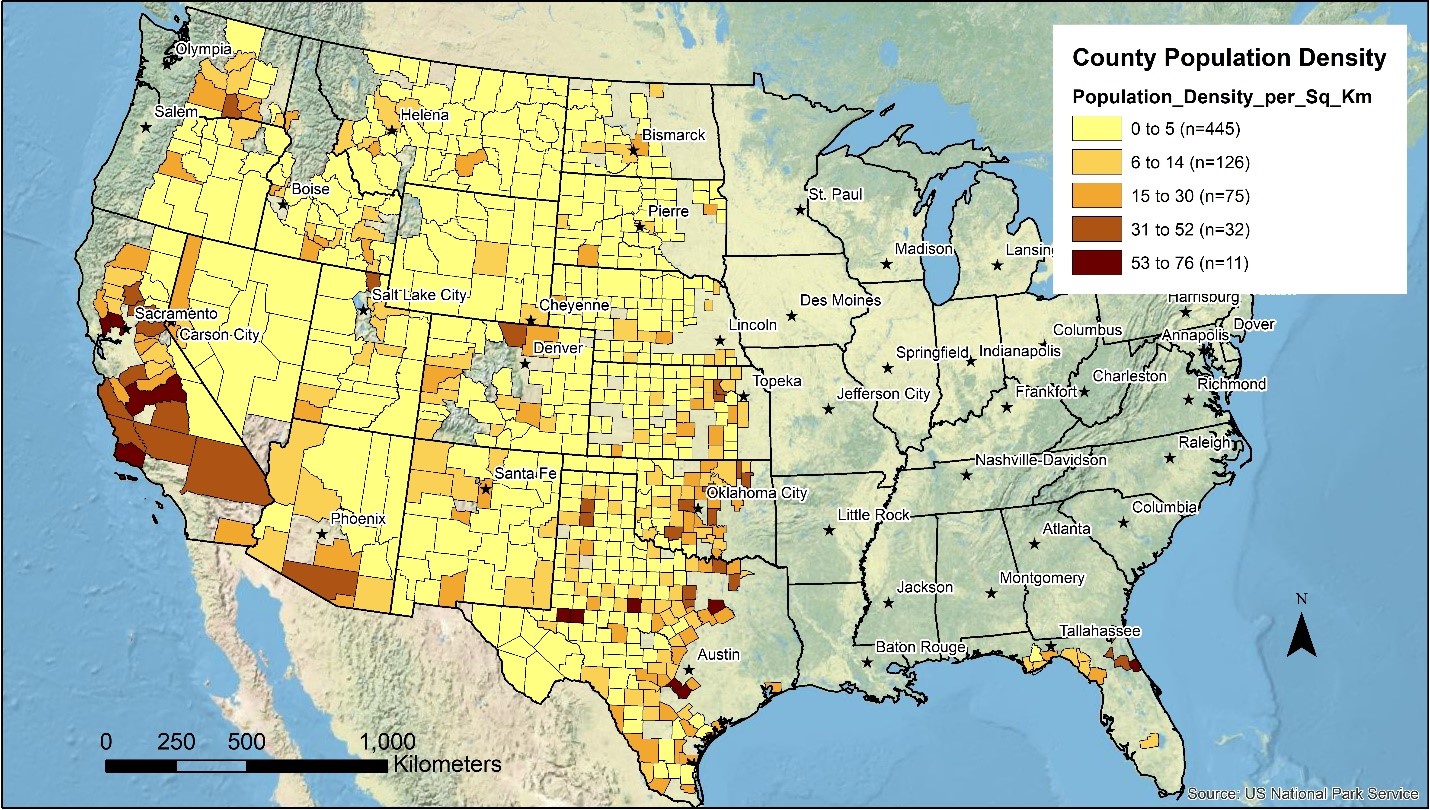
In the end, the two maps above show the results for 690 Counties in western US and Florida that were included in the assessment. There were two counties that met the area and population criteria that were ultimately excluded from the final assessment due to lack of data.
Other Geographical Scales for the Assessment
We felt that there would be interest in the assessment of rangeland sustainability at different geographic scales. We chose to use Major Land Resource Areas (MLRA), Küchler ecoregions, and Congressional Districts.
We allocated the county data to MLRA, Kuchler Ecoregions, and Congressional Districts based on the percent of each unit within a county times the indicator value for that county. Those allocated values were then summed for each unit.
Ecological, Social, and Economic Indicators
Ecological, social, and economic indicators were adapted from the original 64 RR indicators (https://www.rangelandsroundtable.org/projects/criteria-and-indicators/). Not all indicators have national level data available or the data sets that were found did not fit what was developed in the early 2000’s. We ended up with 9 ecological indicators, 8 social indicators, and 9 economic indicators. Some of the indicators used were composites of the original indicators. For example, one of the original social indicators was an Index of Social Structure Quality. At the time the indicators were originally developed, no such Index existed so it was considered aspirational. A group has since developed a Distressed Communities Index which included two of the original indicators (education and poverty) along with other data from the U.S. Census and the American Community Survey. Many of the economic indicators combined raw data from the U.S. Census of Agriculture.
In order to compare and contrast individual indicators, data were standardized from 0-100 for each indicator. Means and standard deviations from the mean standardized score were then used to map each indicator and to combine them for further analysis.
For each indicator, ArcGIS was used to develop maps based on where each rangeland county fell in terms of the mean and standard deviation from the mean. We classified counties that fell within -0.5 and 0.5 standard deviations from the mean as Sustainable. Those that fell -1.5 to-0.5 standard deviations as Less Sustainable and <-1.5 as Unsustainable. Those that fell 0.5 to 1.5 as More Sustainable and >1.5 as Most Sustainable. To be clear, those categories are an individual county compared to the other 689 rangeland counties rather than compared to some standard of sustainability.
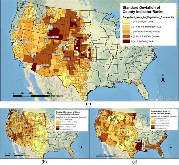
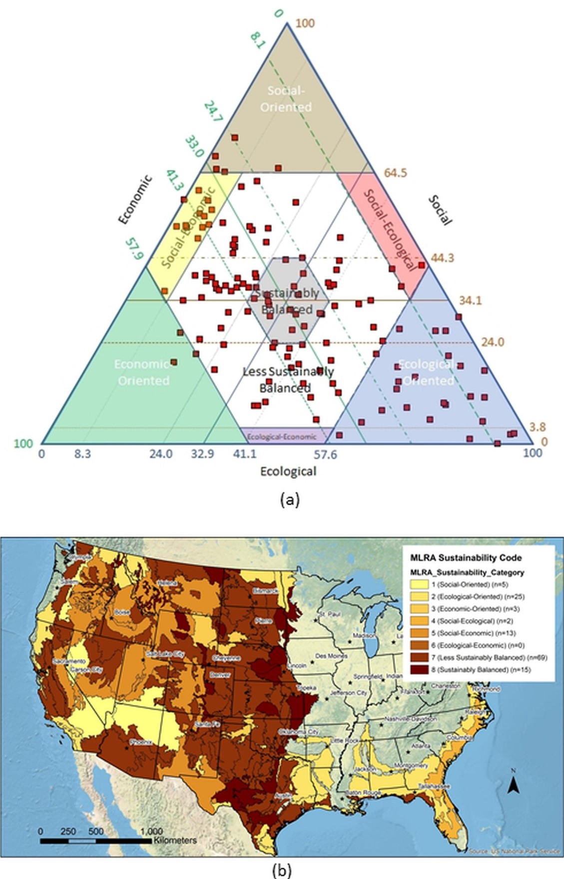
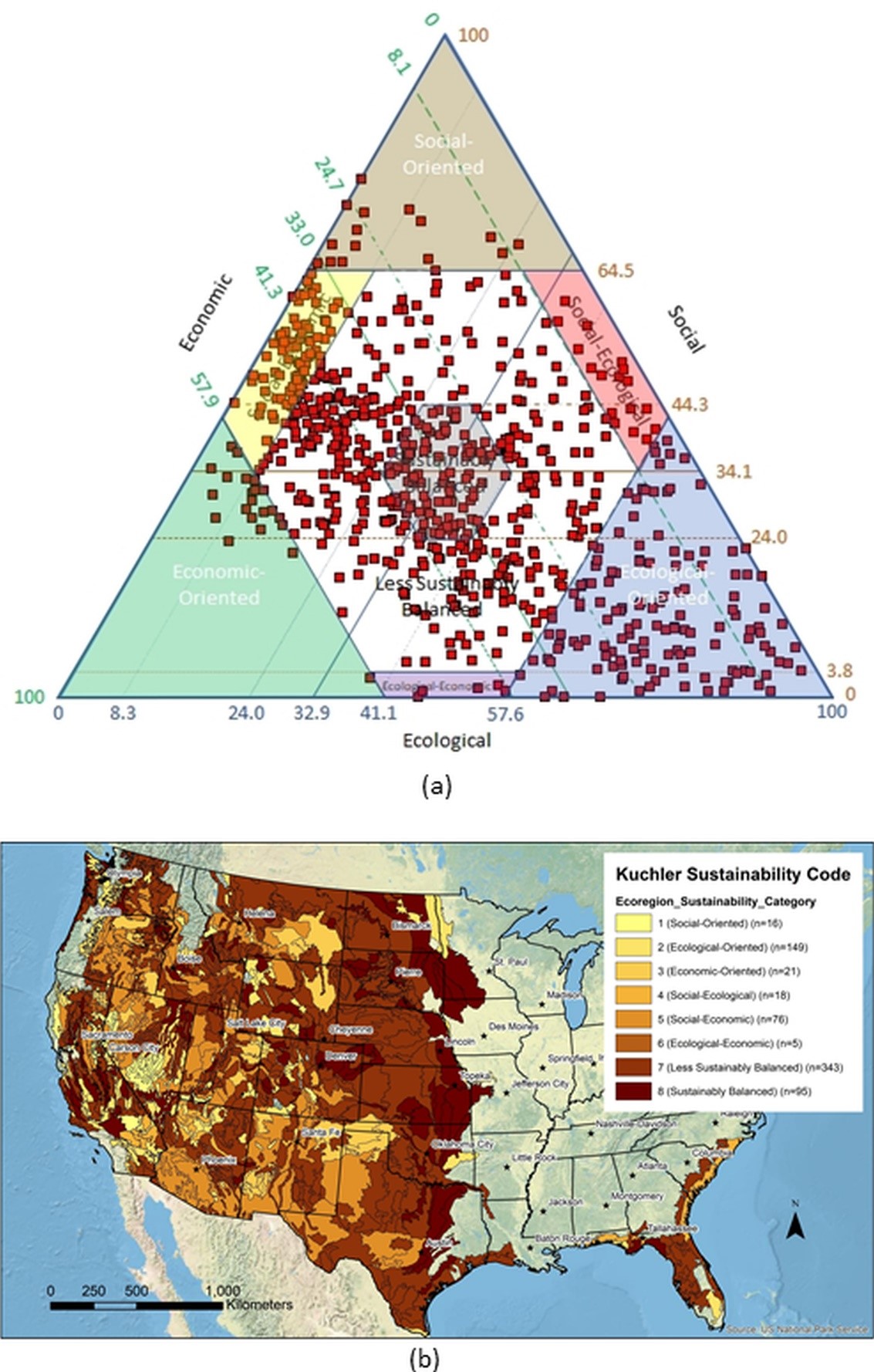
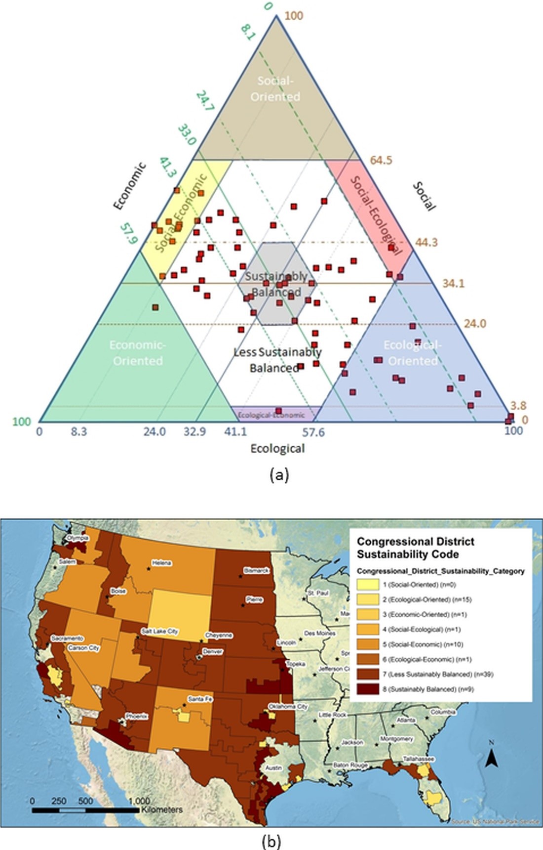
Additionally, county level data were aggregated in Major Land Resource Areas (MLRA), Küchler Ecoregions, and Congressional Districts. Because not every county is represented in each of these aggregations, the maps miss some of the nuances and would only represent those counties we classified as rangeland counties (greater than 25% rangeland and less than 200 people per square mile).
As an example, when rangeland area was mapped for each county, counties shown in dark brown had the highest percentage of their land base in rangelands. These were concentrated in the northern Great Plains, Northern Rocky Mountains, and Desert Southwest where few people live. When the data were aggregated by ecoregion or MLRA the resulting maps somewhat follow the same pattern but not always. The ecoregion and MLRA boundaries do not follow county boundaries and therefore included county areas that were not considered rangeland counties. That is especially evident in the Southeast where a Florida county may include a small piece of either an ecoregion or MLRA and hence their data was attributed to the whole area. While the county maps are more accurate, the other maps give an indication of what is occurring outside of political boundaries.
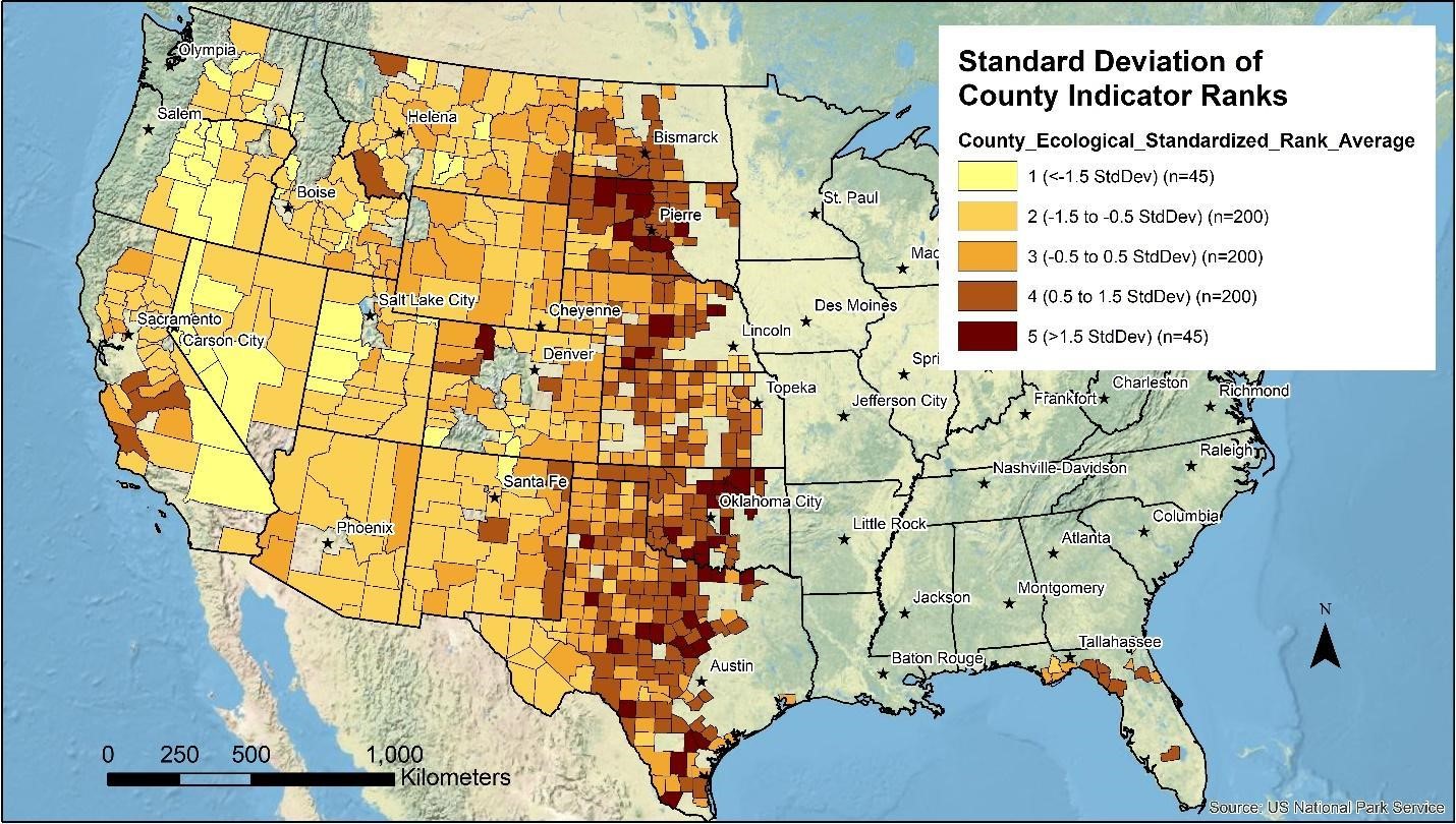
Similar maps were developed for each indicator. Combining all of the ecological indicators for each county results in an overall view of where each county falls compared to the other 689 rangeland counties. As shown on the following map, the Great Plains counties appear to be the best ecologically and the Great Basin counties the lowest.

Standardized scores were then combined to compare states and counties within states. For the ecological indicators, we can show how each state compares to the other states. Since each indicator was standardized from 0 to 100, for the ecological indicators, the maximum score would be 900.
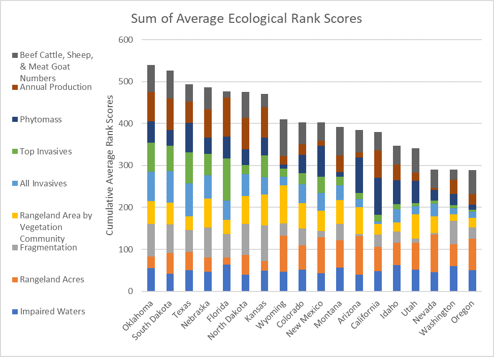
The same thing could be done for counties within each state to see which indicators seemed most and least important. In the case of states, Oklahoma seems to score highest on annual production, invasives (higher score means fewer invasives) and fragmentation (higher is better or lower fragmentation) whereas Oregon sores low in phytomass, invasives, and fragmentation.
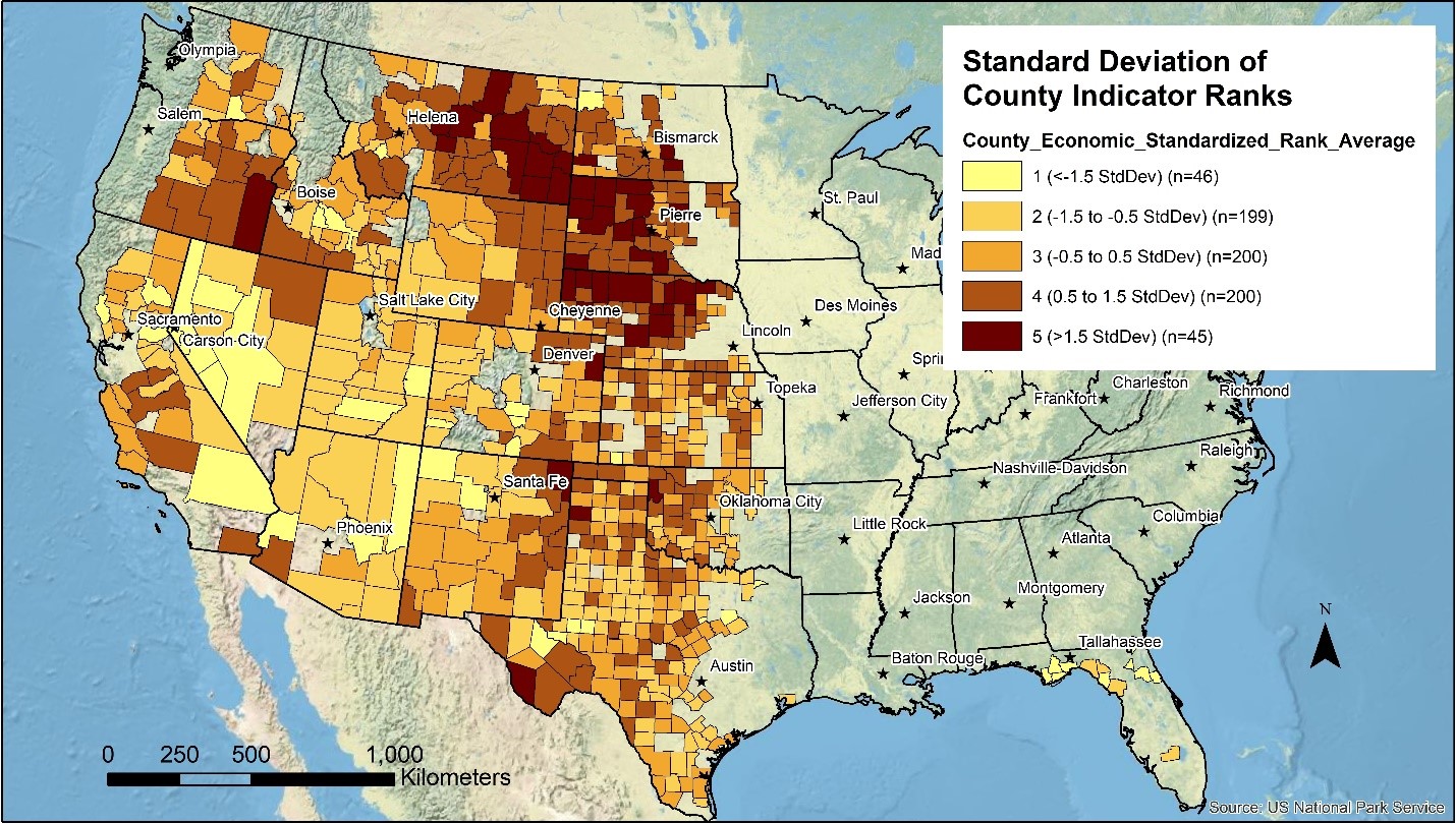
Similar maps and charts were developed for the social and economic indicators. For the social indicators, the counties doing the best are much more scatted than the ecological indicators, but seem more concentrated in the Wasatch Front and Desert Southwest. For the economic indicators, the concentration of those doing the best appear to be in the Northern Great Plains.
How to Assess Rangeland Sustainability
Defining sustainability has been a vexing problem. While a definition such as described earlier sounds good in concept, putting numbers to it and knowing what number is sustainable has been challenging. We do not profess to find that number here, but rather have approached it as comparing one area to all others. Whether any or all of the individual areas is sustainable based on this analysis is up for discussion. That is the purpose of this national assessment and for RR as a whole, to provide the data for an informed discussion of sustainability at whatever scale is desired. Personal preferences and values frame how an individual, group, or organization interprets the same data.
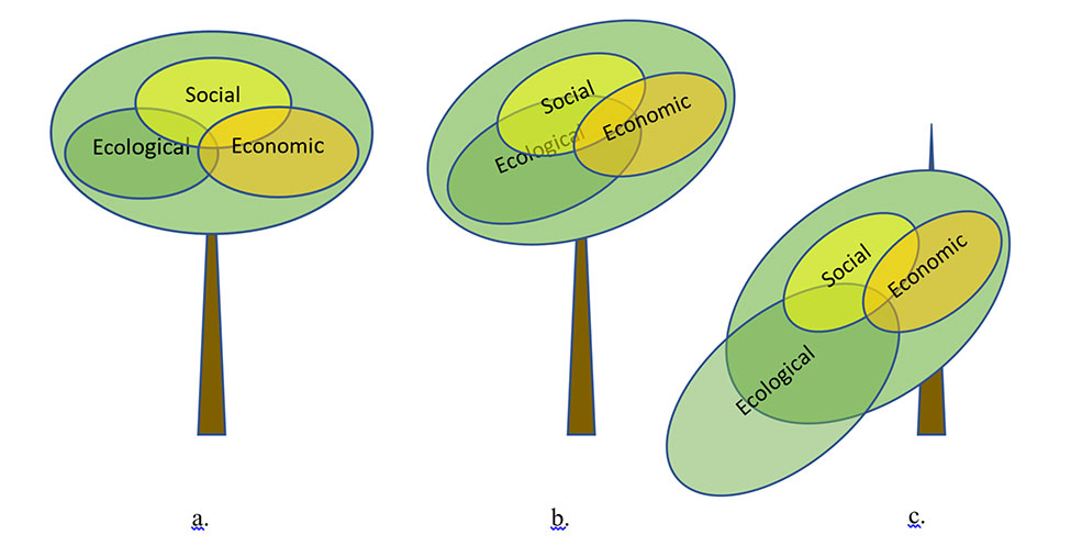
So how do we put all the disparate data together to foment such a discussion? Sustainability is often depicted as a Venn Diagram where the sustainable region is where the 3 circles overlap. This assumes that each area is given equal weight by society and that the overlapping area can be defined.
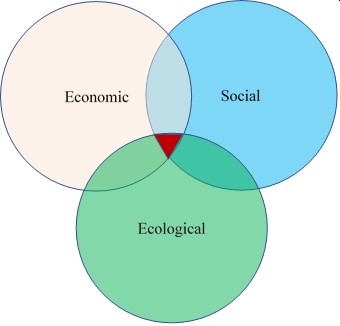
Another way of looking at sustainability would be if the 3 circles were somehow balanced on a fulcrum and balance is achieved when all are roughly equal. If society were to place more weight on one area (ecological in this example), the plates would begin to tilt towards that area but it is still roughly balanced. If too much weight is given to that area, the plates fall off the fulcrum and the system would be unsustainable. While this depiction may help in understanding sustainable or unsustainable, it still has the same issue of how you define each circle.
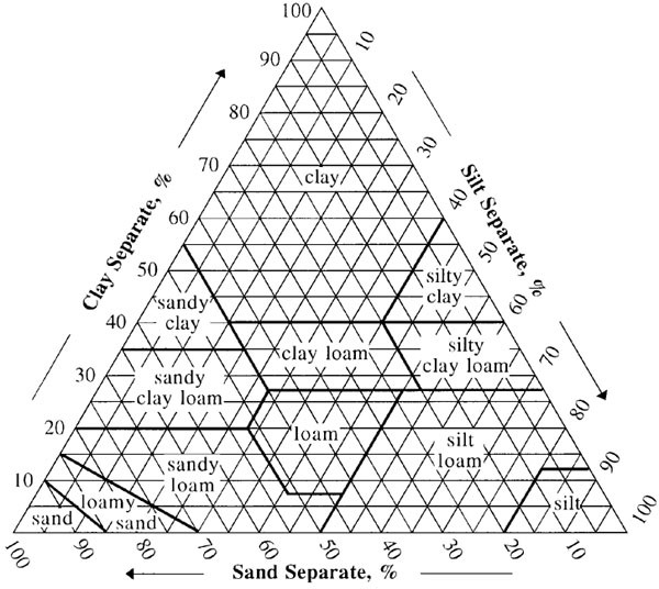
The way we have chosen to put our standardized data into a representation of sustainability was to use the Soil Texture Triangle as a starting point. In that triangle, the percent of sand, silt, and clay has to equal 100% and different regions of the triangle are given names such as clay loam.
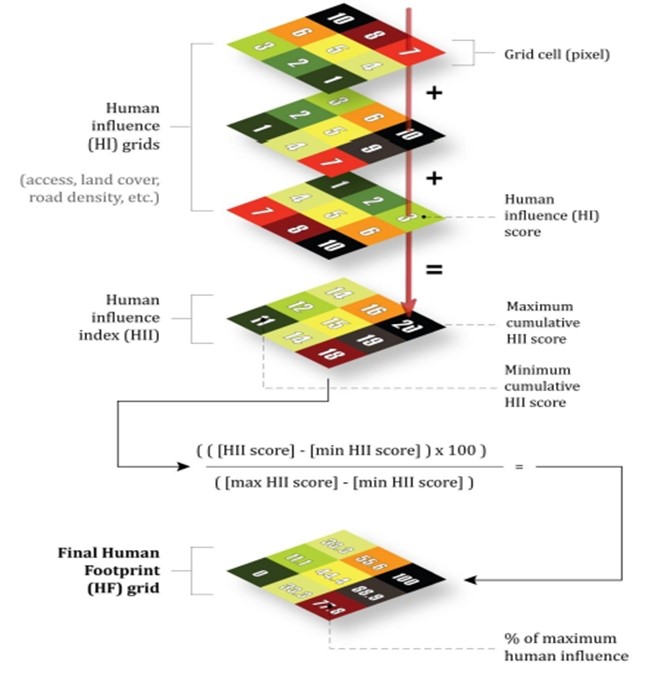
In addition, a method described as the Human Footprint used a mapping technique where different data were scored from 1-10 in each pixel and those scores were added together into a new score for that pixel called a Human Influence Index that was then re-standardized into a Human Footprint score and mapped.
Following that approach, we developed what we call the Sustainability Triangle. Similar to the Human Footprint, each standardized score for each ecological, social, or economic indicator is added together and re-standardized into a final ecological, social, or economic score. Those final scores are then placed into the Sustainability Triangle. We defined areas based on the standard deviations from the mean for each total score.
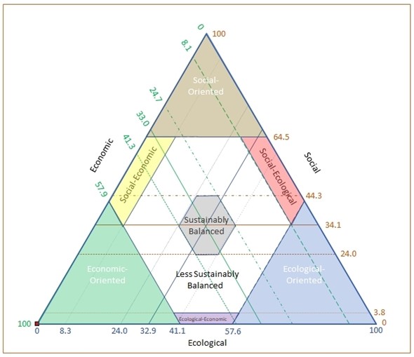
Plotting all 690 counties on the Sustainability Triangle results in each county falling within one of the regions above. We can further map each county based upon where it falls within the Triangle. While each category appears distributed throughout the rangeland counties, the Sustainably Balanced counties appear more concentrated in the Great Plains.
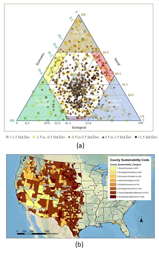
Examining the results of the Sustainability Triangle based on MLRA, Ecoregions, and Congressional Districts shows similar results. It is important to keep in mind for these aggregations that each area only represents the rangeland counties within each aggregation. The Triangle and maps, therefore, only represent what is happening relative to rangelands and low population areas.
The Sustainability Triangle is only meant to show “balance” among the social, economic, and ecological areas of sustainability. It does not show which area is most important, define a standard, or indicate good or bad. The good or bad interpretation of the data depends on an individual’s or groups’ perspectives or values.
Because we only used 2017 data, it is not possible to depict which direction each county is headed (i.e., trend) in the different areas. While social and economic data are generally available for most of those indicators, it was not possible to do the ecological indicators with the same degree of certainty. Not all of the social and economic indicators could have been done over time either because of new data definitions, collection methods, or interpretations. Hence, we chose to do the one point in time in the hopes that future efforts will build upon what we have developed to look more closely at trends.
Rangeland Sustainability - Case Studies
Our goal in doing this national assessment was not to come to a conclusion that one area is doing better in social, economic, and ecological sustainability and another is doing worse. As has been discussed, sustainability is a subjective term dependent upon an individual or group’s values. What we have done instead is to define the data that can be examined and to have a fact-based discussion about sustainability. If an area can identify where it is weak, that provides a place to begin those discussions.
We chose to look at 3 arbitrary case study areas to demonstrate how that might work, the Wasatch Front, Northern Great Plains, and Central Great Plains. There is nothing particularly special about the areas other than they seemed to be different from each other in how their indicators ranked.
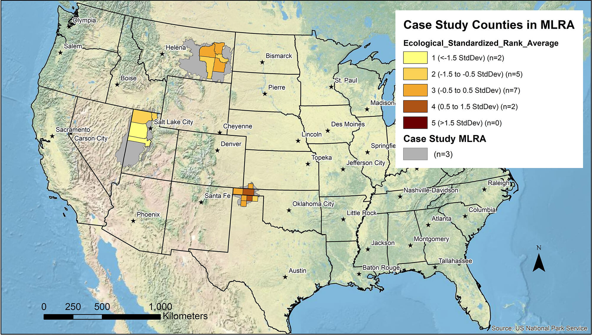
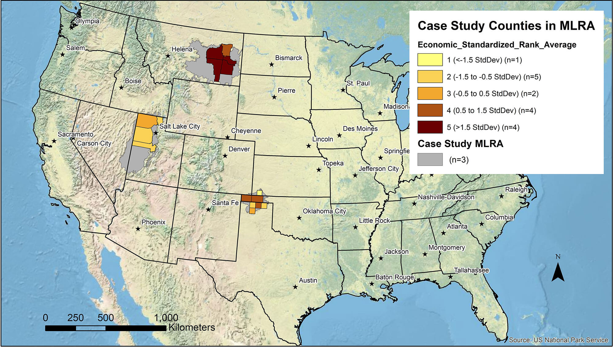
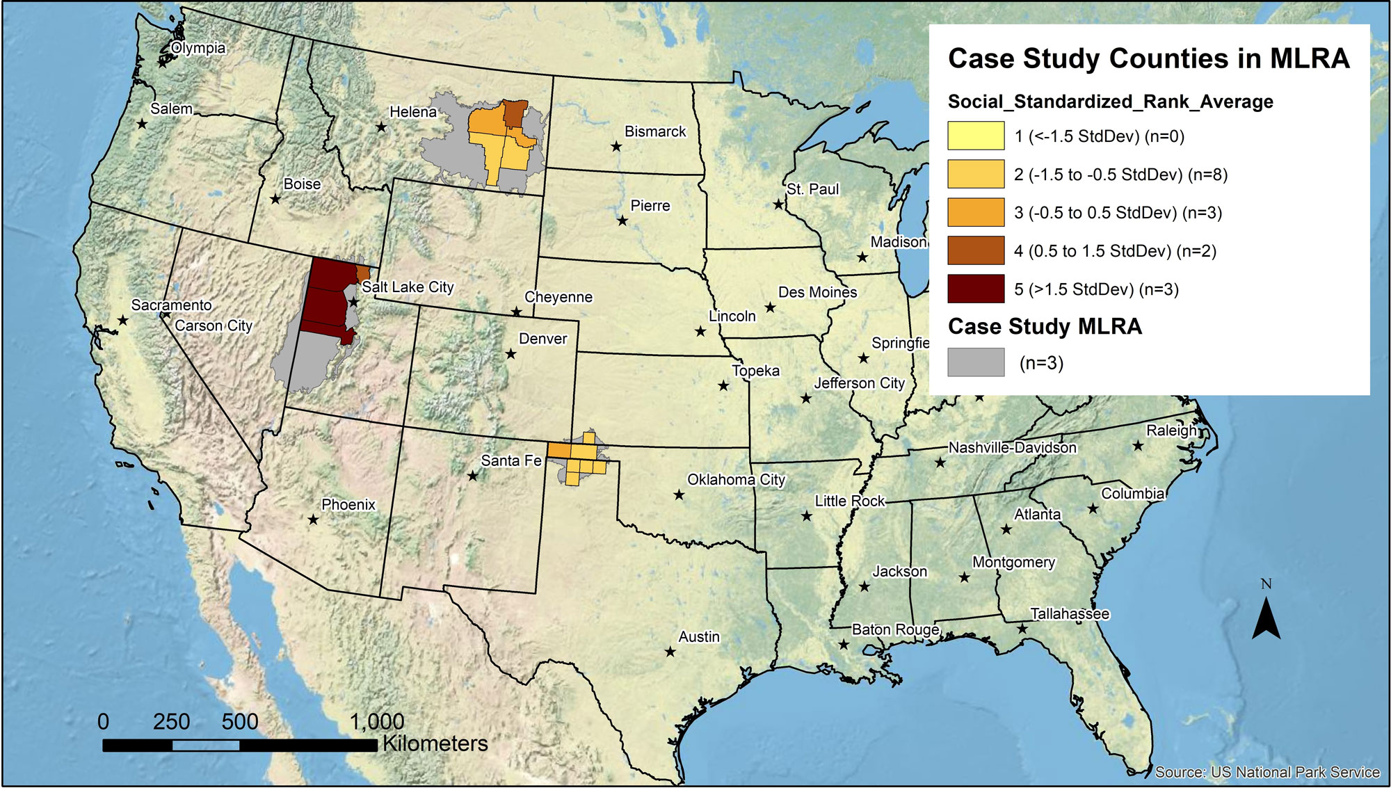
The following maps show the 3 case study areas and how those counties ranked in total, ecological, economic, and social indicators. The following discussion of the case study areas will refer back to these maps.
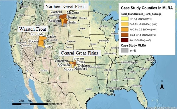
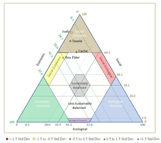
Wasatch Front
The Wasatch Front covers the counties (surrounding Salt Lake City, Utah including Box Elder, Cache, Juab, and Tooele counties. Fifty-two percent of the counties are rangeland. Population density is 12.4 people per square mile. Many of the resident’s commute to Salt Lake City or are otherwise dependent upon it. This case study area is an example of rangeland areas existing in the presence of a large and growing urban area.
What can be seen from the maps is that in total the Wasatch Front counties rank as Sustainably Balanced to Less Sustainably Balanced. It tends to rank low ecologically, moderate economically, and high socially. In this case, if the counties or the region wanted to improve, the discussions may start with the environment being aware that decisions made may affect the economic and social components of the area. This is shown in the Sustainability Triangle with 3 of the counties falling in the Social-Oriented category and one in the Social-Economic.
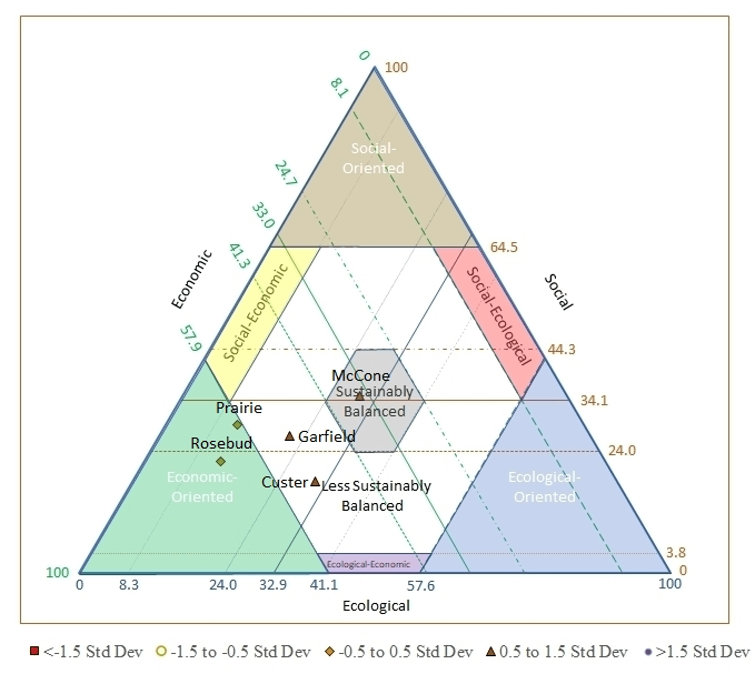
Northern Great Plains
This region includes parts of eastern Montana and is comprised of Custer, Garfield, McCone, Prairie, and Rosebud counties. For the counties in this case study, we estimate that 52% of the area is rangeland. The largest town in the case study area is Miles City in Custer County. The Northern Cheyenne Reservation is in the southern part of Rosebud County. Population density averages 1.3 people per square mile.
What can be seen on the maps is that this area ranges from Sustainably Balanced to More Sustainably Balanced. The area tends to rank lowest in ecological indicators, moderate in social indicators, and highest in economic indicators. Only 2 of the counties rank Less Sustainably Balanced for ecological indicators. In general, this area appears to be doing fairly well in terms of rangeland sustainability and the communities that depend upon them.
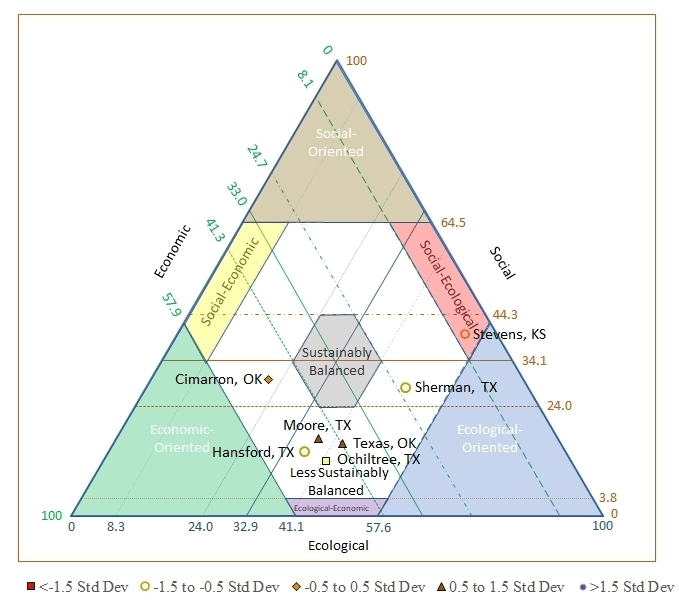
Central Great Plains
This region includes Stevens county, Kansas, Texas and Cimarron counties in Oklahoma, and Hansford, Moore, Ochiltree, and Sherman counties in Texas. For the counties in this case study, we estimate that 58% of the area is rangeland. Population density averages 3.2 people per square mile and the region is characterized by declining populations.
The counties range from Less Sustainably Balanced to More Sustainably Balanced. The area ranks low in social indicators, moderate in economic indicators, and higher in ecological indicators. It appears that most of the counties are Less Sustainably Balanced for social indicators.
Caveats and Conclusions
Data Limitations
As has been stated before, very few national scale data sets exist. In the cases where it does exist, it is not always available at scales such as counties. For example, in the case of the Census of Agriculture, while county level data are reported, there are counties where the data are not released due to confidentiality concerns and those show up as (D) or nondisclosed. In those cases we did resort to assigning those counties with county averages for the rest of the state. That resulted in some counties having more or less of whatever indicator was being assessed. This method allowed us to rank that county consistently throughout the assessment, but the relative rank may not be accurate. We felt that this was the best alternative to merely ignoring that county and having a different number of ranks for each indicator. In general, the Census of Agriculture uses nondisclosure on the same counties.
The most important thing we have discovered is that national level data sets are messy and disaggregating them to states and counties is difficult. While the federal government collects a lot of data, over time, their methodologies change, questions are dropped and added, and the analysis of the data they have varies. For many indicators, national level data are simply not collected; or, if it is, it may be at only one point in time.
Generally speaking, social and economic data are collected by various federal agencies. Ecological data are not generally collected and made available at the national scale. Some of it is statistically collected at the national scale, but not at the county scale. Some of the data had to be pulled state-by-state, remote sensing, spatial modeling, or “citizen science” and not on the scientific method with any level of statistical validity.
Future Research
Chapter 7 of the National Assessment book discusses research needs by indicator and is not repeated here. Suffice it to say here that in many cases methods and analysis procedures are well known at the local level but the likelihood of aggregating to the national scale is problematic. In some cases, it may be possible to collect national scale data (especially ecological) similar to what is done for social and economic data, but there is no single agency tasked with that duty. In some cases, multiple agencies collect similar ecological data but may use different scales or methods and the ability to aggregate those data across the whole landscape has not been entirely tested.
Needless to say, research is needed on the vast majority of the 64 Indicators identified by the RR. Beyond how to collect the data is the need to determine if the indicator itself is appropriate to say anything about rangeland sustainability and the communities that depend upon them. Current research on different indicators is occurring and we expect our list of research by indicator to change through time. What we thought were good data in 2005 may only have been collected one time.
Future Assessments
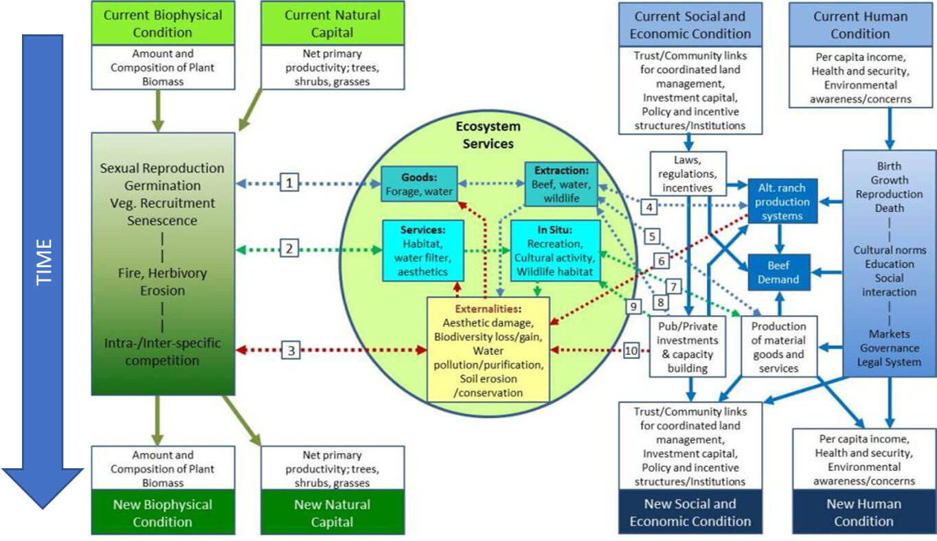
Based upon the Integrated Social, Economic, and Ecological Conceptual framework (ISEEC), one of the key components of a sustainability assessment is the ability to look at changes over time.
Because we only had ecological data for 2017, we made the choice to do a point-in-time assessment. Future assessments should build upon this as data becomes available. While much of the social and economic data collected by the federal government is done either annually, every 5 years, or decadal, the ecological data appears to be more haphazard. Using archived geospatial data can help in the future to see how the biophysical condition and natural capital changes over time.
It is our hope that this national assessment can be built upon in 5- or 10-year increments. If that were to be the case, a true assessment of rangeland sustainability and the communities dependent upon them can be completed. If the same methodology were to be followed in future assessments, then changes in ecological, social, and economic indicators can be better explained.